Hi everyone! Happy Tuesday!
I am hanging out with the Neat and Tangled Team for another month of fun! This release is SO incredible, and I am having such a great time! All of the new gorgeous products will be released on Friday, March 9th!
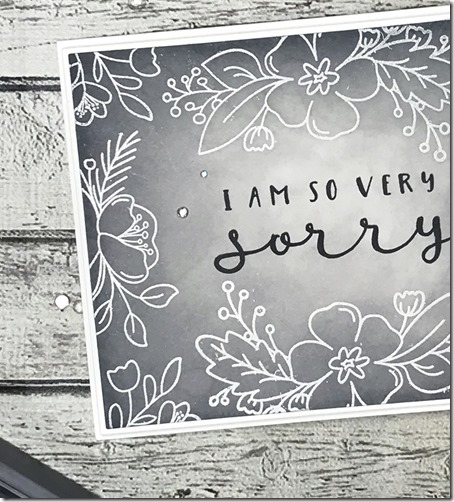
Today I have a card to share you with using the beautiful new No Words set, which is the absolute perfect set for when you just don’t know what to say. It’s essential. I have paired No Words with the gorgeous new Friendly Florals set, which you will see more of tomorrow.
For my card, I began with a panel of white card stock, and I stamped the flowers from Friendly Florals using Versamark Ink and then heat embossed them with white embossing powder. I then sponged on Hickory Smoke Distress Oxide Ink (I LOVE this new color) around the edges, blending in toward the center of the card. I added more ink to the edges so that they are much darker than the center. I then stamped “I AM SO VERY SORRY” from No Words using black Ink. I finished off the card with a trio of rhinestones.
Here are the sets I’ve used today!
Thanks SO much for stopping by! Please head over to the Neat and Tangled Blog to check out what the team has created!


Love your card and the Hickory Smoke Distress Oxide background sets off the white embossed florals and sentiment very nicely!
ReplyDeleteYour gray and white looks wonderful--nice shading. I've never used these colors alone before....
ReplyDeleteBeautiful and elegant card!!!
ReplyDeleteBeautiful, understated elegance! I just love your color choices and the composition. Thanks for sharing your creativity!
ReplyDeleteSimple elegance. Love this ♥
ReplyDeleteThis is a beautiful sedate colour palette for this type of card.
ReplyDeleteDefinitely pinned your card! Love the unusual color palette, stands out.
ReplyDeleteSo pretty with the white and grey.
ReplyDeleteI would never have thought a gray and white card coule be so pretty. Great Job! From: Jeanne at Jeanneragan@yahoo.com
ReplyDeleteSympathy cards are so hard, but you really nailed it. That gray inking is perfect!
ReplyDeleteOoh !! What a beautiful card, so original and elegant !!
ReplyDelete[margessw(at)icloud(dot)com]
Wow, great card! You’ve sold me on this ink!
ReplyDeleteGORGEOUS!!!! Your color combo is soooo elegant! Love this!
ReplyDeleteI absolutely LOVE this color combo and that hickory smoke ink may have to find it's way home to me.
ReplyDeleteBeautiful tonal design. Perfect for the occasion.
ReplyDeleteBeautiful tonal design. Perfect for the occasion.
ReplyDeletevery nice!
ReplyDeleteLove these stamp sets, especially the font on the No Words.
ReplyDeleteBeautiful design and the greyscale is lovely!
ReplyDeleteThis is so beautiful and the gray is perfect!!! Too often I see sympathy cards in garishly bright colors because people think they need to color flowers in bright colors. My mom taught me to pick out sympathy cards with subdued colors and pretty words, and you accomplished both things :-)
ReplyDeleteOh wow this so pretty . Love the gray with the white .. amazing creation.
ReplyDelete